A modern brand renewal for a modern energy company
TAMPERE ENERGY
In August 2023, the Tampere Electricity Company changed it’s name to Tampere Energia (Tampere Energy). The visual look of the new brand had to correspond to the company’s clarified strategy.
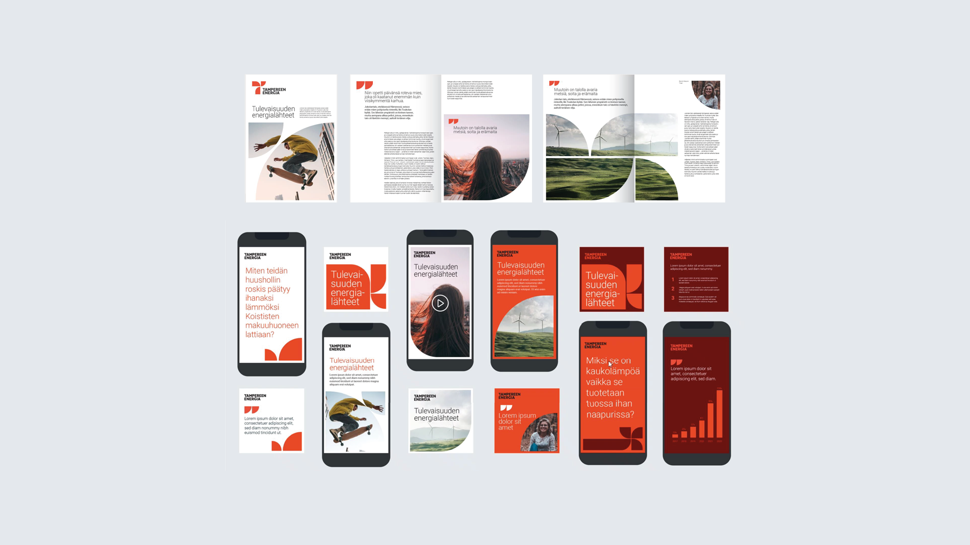
The visual elements of the renewed brand are based on the stratecig priorities of Tampere Energy. The design was also guided by the principles of a high-quality brand identity: strong distinctiveness, originality that draws on brands own strengths, and a fresh contemporary feeling.
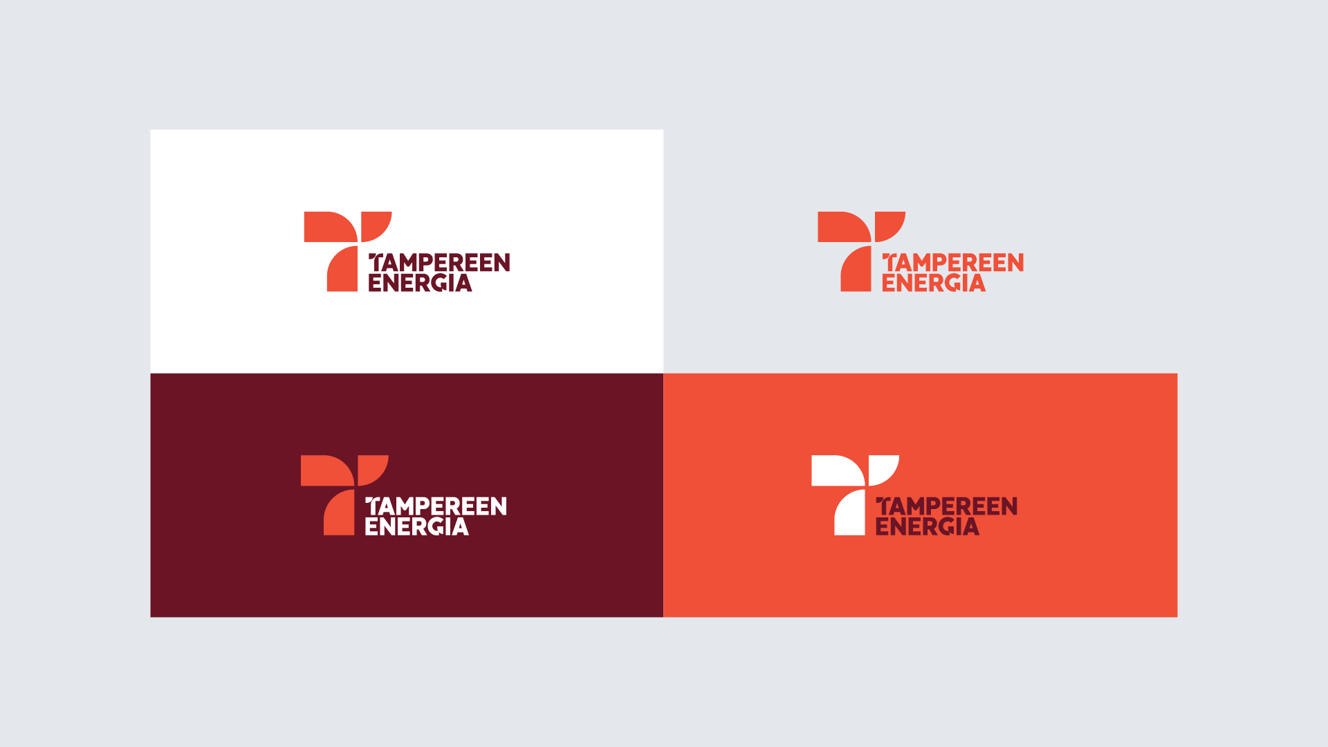
In the design of the brand logo you can see the letter T, which is important to Tampere, as well as the main forms of energy produced by Tampereen Energia – district heating, cooling and electricity. Associations with wind power and renewable energy were also desired. The design of the logo also serves as the basis of the visual concept applied to the entire look.
The brand’s new main color is orange-red, glowing with warmth – a color that strongly connects the company to it’s roots in the tradional redbrick industrial buildings of Tampere.


